Thursday, 24 October 2013

Josef Albers


Bauhaus typography was typically unadorned and clean; san-serif types and strong horizontal
and vertical rules were characteristic. They believed: “Typography is an instrument of communication. It must present precise information in a suggestive form… For legibility, the message must never suffer from a priori aesthetics.”

The Architype Albers typeface, designed by Freda Sack and David Quay, is a revival of the typographic experimentation of Bauhaus Professor Josef Albers.
Albers produced sketches for geometrically constructed, universal, sans-serif, stencil typefaces the “Kombinationschrift” alphabets.


He used 10 basic shapes drawn on a grid in a size ratio of 1:3. It consisted of the perfect harmony of circles, squares and rectangles and their combinations, to write any letters or numbers. The system was simple, easy to learn, efficient, cheap for production and expressed purity, regularity and simplicity. The typeface was designed for use on posters and in large scale signs; it was never intended to be used for text.

Albers followed the theory of Die Neue Typographie, or "New Typography". Brought to the Bauhaus by László Moholy-Nagy and put to print by Jan Tschichold in his design manifesto; "New Typography" considered typography to be a medium for communication, and was concerned with the "clarity of the message in its most emphatic form". Albers also followed Herbert Bayer in his hypothesis; since speech does not recognize upper-case letters, they are unnecessary in type.


Joost Schmidt


Joost Schmidt received his degree in painting in 1914 at the Großherzoglich-Sächsische Kunstgewerbeschule (Grand Ducal Saxonian school of arts and crafts) in Weimar. He then continued his studies from 1919 to 1925 at the Staatliches Bauhaus in Weimar in the preliminary course taught by Johannes Itten. In 1922, he passed his journeyman’s examination in wood sculpture, along with others. He successfully participated in the poster competition for the Bauhaus exhibition of 1923 and worked intensively on typography projects from 1924.

Within the scope of the preliminary course at the Bauhaus Dessau, all students were required to attend two semesters of the lettering design course taught by Joost Schmidt. Here, Schmidt explored the structure of letters – circle, square and rectangle – and their flexibility in terms of shape and size as well as the treatment of colour and surface. In addition, he had his students examine aspects of advertising such as language, visual effect, psychology and economy. With his teaching, Joost Schmidt strove for the comprehensive reform of lettering, which was to be validated and standardized internationally.

Bauhaus typography


 The Bauhaus was founded in 1919 in the city of Weimar by German architect Walter Gropius (1883–1969). Its core objective was a radical concept: to reimagine the material world to reflect the unity of all the arts. Gropius explained this vision for a union of art and design in the Proclamation of the Bauhaus (1919), which described a utopian craft guild combining architecture, sculpture, and painting into a single creative expression. Gropius developed a craft-based curriculum that would turn out artisans and designers capable of creating useful and beautiful objects appropriate to this new system of living.


The typography workshop, while not initially a priority of the Bauhaus, became increasingly important under figures like Moholy-Nagy and the graphic designer Herbert Bayer. At the Bauhaus, typography was conceived as both an empirical means of communication and an artistic expression, with visual clarity stressed above all. Concurrently, typography became increasingly connected to corporate identity and advertising. The promotional materials prepared for the Bauhaus at the workshop, with their use of sans serif typefaces and the incorporation of photography as a key graphic element, served as visual symbols of the avant-garde institution.


It wasn’t until the summer of 1923 when a poster was made for the school that intrigued others to notice the unique typeset and design. Effective visual communication was a main focus when designing. You will see a balanced layout, vibrant colors, harmony, geometric shapes strong bars, bold and universal type. Using upper case or lower case fonts, but not a combination of the two, the typeset was clear and concise. The type was laid out in various ways. In addition to being horizontal and vertical orientation, Bauhaus is well-known for placing text at angles and also wrapping text around objects.

As the legacy continues, Bauhaus style typography is still used in modern day designs and posters. You will find their style on album covers, posters for movies, events, and signage. One of the most notable was a print designed for the Obama Presidential Campaign, a rally which was held in Berlin.

Robert Rauschenberg


Robert Rauschenberg was a man of American nationality, he was born on October the 22nd in 1925 in Texas and he died on may the 12th in 2008 in florida. Rauschenberg was a man that worked in many different medias such as printmaking, graphic art, painting, photography and papermaker, some of his early work was in the era and style of popart and is well known for his combine paintings which are built up of non-traditional materials and objects being used together..

 Rauschenberg was very interested in the iconography of American popular culture. He worked in the style of Abstract Expressionists without losing the expressiveness by developing a style that included collage and used materials that were easy to come across such as house paint. Rauschenberg used unusual techniques such painting with a tire that he had dipped in ink. He expanded his collages by uaing three and two dimensional objects in one piece of work, which he referred to as “combines.” This ground-breaking technique contributed to the course of modern art and creative expression. The works are sometimes called Neo-Dada. Rauschenberg’s fascination with popular imagery and his anything goes attitude when it came to his work strongly influenced Pop Art.
Rauschenberg used images of current events which he gathered from magazines and the newspapers for his 1964 collage Retroactive 1 (1964). A large press photograph of John F. Kennedy speaking at a televised news conference was the source for this screen print on canvas. He combined the image of Kennedy with another photo silkscreen of a parachuting astronaut. The overlapping of the two images creates a colourful visual commentary on a culture struggling to come to grips with the television era.

Rauschenberg studied at the Kansas city art institute, at the academie Julian in paris, france and also at the black mountain college in north Carolina. From 1949 until 1952 rauschenberg was a student at the arts students league of newyork.
In a lot of his work Rauschenberg used the process of silk screen printing to transfer photographs on to a canvas. In 1951 Rauschenberg created a series of work known as the White Paintings, in the style of monochromatic painting, the purpose of which was to make a painting seem its most essential nature, and to give the impression of being pure.

 When I look at Robert Rauschenberg’s work straight away I can see that most pieces of his work are in the style of abstract expressionism, I knew this by the old free lashings of paint in different colours and also by looking at the way that he layers images and paint over eachother this gives he work a lack of control, abstract feel to it  and it works really well in most pieces of his work.
I also really like the way that Rauschenberg uses different media in his work he incorporates printing into his work as well as painting and other methods of creating an image and I think that this is what makes rauschenberg’s work different from other artists that work in the abstract expressionist style.

Tuesday, 21 May 2013

sister corita

Alice matkin.
Unit 5 contextual influences folder.
Sister corita.

Sister corita whose real name was corita Kent was born in iowa in November 1918, sister corita was part of the roman catholic order and whils she was here she took creative classes at multiple institutes until she earned her BA in 1941 she then went on to study at university whilst still being a sister in the order she earned her MA in 1951.
 

 She worked mainly with the media of silkscreen serigraphy and other forms of printing and helped to establish it in the world of fine art. Her artwork which has strong messages of love and peace incorporated into it and she was particularly popular during the 1960s and 1970's,she used popular culture such as song lyrics and advertising slogans in her work and this is what seems to have made he work so appealing to the public and the messages behind her work were clear so the pieces that she created actually had meaning and weren't just images pieces of her work such as her piece called for emergency use soft shoulder which was created in 1966.

Whilst working at the immaculate heart college in the art department, sister corita put into place rules that applied to both her students and the staff and these rules were made so that everyone would put there all in and to make mistakes and failing disappear.
 

Rule I
FIND A PLACE YOU TRUST AND THEN TRY TRUSTING IT FOR A WHILE.

Rule 2
GENERAL DUTIES OF A STUDENT:
PULL EVERYTHING OUT OF YOUR TEACHER.
PULL EVERYTHING OUT OF YOUR FELLOW STUDENTS

Rule 3
GENERAL DUTIES OF A TEACHER:
PULL EVERYTHING OUT OF YOUR STUDENTS
Rule 4
CONSIDER EVERYTHING AN EXPERIMENT.

Rule 5
BE SELF DISCIPLINED. THIS MEANS
FINDING SOMEONE WISE OR SMART AND
CHOOSING TO FOLLOW THEM.
TO BE DISCIPLINED IS TO FOLLOW IN A GOOD WAY.
TO BE SELF DISCIPLINED IS TO FOLLOW IN A BETTER WAY.

Rule 6
NOTHING IS A MISTAKE. THERE’S NO WIN AND
NO FAIL. THERE’S ONLY MAKE.

Rule 7
The only rule is work.
IF YOU WORK IT WILL LEAD TO SOMETHING.
IT’S THE PEOPLE WHO DO ALL OF THE WORK ALL THE TIME
WHO EVENTUALLY CATCH ON TO THINGS.

Rule 8
DON’T TRY TO CREATE AND ANALYZE AT THE
SAME TIME. THEY’RE DIFFERENT PROCESSES.

Rule 9
BE HAPPY WHENEVER YOU CAN MANAGE IT.
ENJOY YOURSELF. IT’S LIGHTER THAN YOU
THINK.

Rule 10
"WE’RE BREAKING ALL OF THE RULES. EVEN
OUR OWN RULES. AND HOW DO WE DO THAT
BY LEAVING PLENTY OF ROOM FOR X QUANTITIES." JOHN CAGE
HELPFUL HINTS: ALWAYS BE AROUND. COME OR GO TO EVERY- THING. ALWAYS GO TO CLASSES. READ ANYTHING YOU CAN GET YOUR HANDS ON. LOOK AT MOVIES CAREFULLY, OFTEN. SAVE EVERYTHING IT MIGHT COME IN HANDY LATER. THERE SHOULD BE NEW RULES NEXT WEEK.

Corita Kent’s Rules & Hints for Students and Teachers.
Kent, Corita & Jan Steward, Learning by Heart; Bantam Books, 1992.
 

When I look at sister corita's work I notice that she uses bright colours and different sizes of font and this is used effectively to draw your attention to the key points of her work which is usually a piece of typography for example on her pieces of work that are about Vietnam she will use typography and colour to emphasise the word love.


Tuesday, 5 March 2013

Leonardo Da Vinci

Leonardo Da Vinci was an italian man with many different occupations, such as architecture, painting and sculpting and engineering. Leonardo used architectural techniques to create an ink drawing of a man which was named the Vitruvian man this piece of work shows a man inside a circle inside a square and without looking into the methods behind this piece it is unclear as to why he did this but when you read into it and look at the piece in more depth you realize that it is to do with proportion and measurement, the measured that Da Vinci used are listed below.
  • the length of the outspread arms is equal to the height of a man
  • from the hairline to the bottom of the chin is one-tenth of the height of a man
  • from below the chin to the top of the head is one-eighth of the height of a man
  • from above the chest to the top of the head is one-sixth of the height of a man
  • from above the chest to the hairline is one-seventh of the height of a man.
  • the maximum width of the shoulders is a quarter of the height of a man.
  • from the breasts to the top of the head is a quarter of the height of a man.
  • the distance from the elbow to the tip of the hand is a quarter of the height of a man.
  • the distance from the elbow to the armpit is one-eighth of the height of a man.
  • the length of the hand is one-tenth of the height of a man.
  • the root of the penis is at half the height of a man.
  • the foot is one-seventh of the height of a man.
  • from below the foot to below the knee is a quarter of the height of a man.
  • from below the knee to the root of the penis is a quarter of the height of a man.
  • the distances from the below the chin to the nose and the eyebrows and the hairline are equal to the ears and to one-third of the face.

life drawing - full body

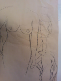
today we had a full body life drawing session, we had to draw from a nude model and this proved to be quite challenging, we started with a drawing a two poses both in which we only had 15 minutes, for our first drawing we were instructed to use pencil and then for the second we were told to use charcoal. The main problem with my first drawings is that parts of the body are out of proportion.
For the second drawing we were shown a method of measuring using our pencils where we measured the height of the head which would become one section and then measure down the body with the same scale to get the correct length of the body and this proved to be very useful and improved the quality of my work. As i became more comfortable with my drawing i began to use the side of my charcoal to add marks to the body as it gave a lighter more shadowed effect.
We were then allowed a short break from our drawing to research into Leonardo Da Vinci's work such as "vitruvian man" which was a way of working out proportion that relates to architecture, after researching into this we returned back to drawing which was still becoming easier the more i did it, this time we were told to do different scaled images and try and fit three to a page, we were given 20 minutes for the first and then 10 minutes for the other two. For the 10 minute ones i focused on key lines that made the figure clear rather than focusing on the details.
for the final three drawings we had to do we were given only 5 minutes for each which i thought would be quite challenging but was actually easy when i put my full focus and attention into it and i was quite pleased with the result i got and learning the pencil proportion skill really helped, as well as looking into Da Vinci's work .
On Tuesday the12th march a week after our first full body session we had another session but this time with an older male model, the same techniques were applied but the male body was much more square and muscular than the females and so it had more tones and lines.
in this session we drew from poses that we had not previously seen and drew certain sections of the body in a larger scale with quite a lot of detail.
The following week we had our third life drawing session, for this we had the male model again, we started out by doing two large 10 minute charcoal drawings just to get us warmed up, i was quite disappointed with my first two drawings as some of the body parts were drawn too thin or fat. 
for our third drawing we were given an hour and a half, we had to draw one image that was the full a2 size and then collage it to create tones on the body for example to show muscles and shadows, i chose to use cartridge paper as my base to draw on and then using a glue stick and watered down PVA glue i layered brown paper, black and white print and tissue paper i also used masking tape for some tones as well and i feel that this was quite effective. I was very pleased with how it was coming together as a piece of work but i failed to work quick enough so was unable to finish it in the set time period.